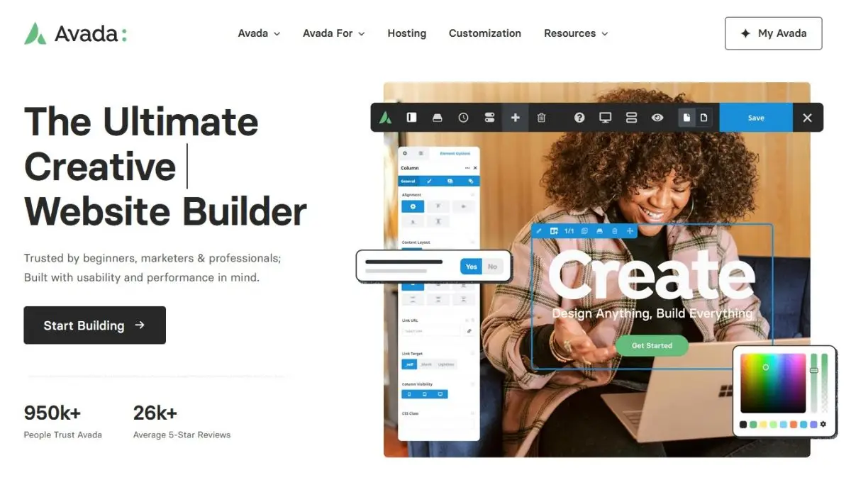
Avada Website Header: A Step-by-Step Guide
Key Points at a Glance
- Introduction to Avada Theme: This section introduces the Avada theme as a versatile solution for WordPress website design, emphasizing its pivotal role in crafting effective website headers.
- Understanding Avada's Builder: Here, the Avada Builder is explored, highlighting its function in creating website elements, particularly its significance in header design.
- Planning Your Header Design: Emphasize the importance of meticulous planning for the header layout, considering factors such as space, logo placement, menu structure, padding, and height to elevate user experience.
- Step-by-Step Guide to Accessing the Header Builder: A detailed guide is provided on accessing the Header Builder within the Avada theme, simplifying the process of header customization.
- Choosing a Pre-built Header Layout: This section guides users through selecting and importing pre-built header layouts from the Avada library, streamlining the header design process.
- Customizing the Header: Here, the steps involved in customizing a pre-built header layout are detailed, covering aspects such as logo placement, menu settings, button customization, and design adjustments to align with branding and functional requirements.
- Utilizing Dynamic Values from Options Page with Advanced Views Shortcode: Learn how to integrate dynamic content from an options page using Advanced Custom Fields (ACF) and Advanced Views Lite plugin to enhance header functionality.
- Optimizing for Mobile Devices: Strategies for optimizing the header for mobile devices are explored, including techniques for removing unnecessary elements and adjusting visibility settings to ensure a seamless user experience.
- Testing and Final Touches: Emphasize the importance of thorough testing across various devices and making final adjustments for optimal performance before deployment.
Table of Contents
Introduction
The significance of a website header cannot be emphasized enough—it serves as the primary navigation tool for users and significantly influences the overall design and subsequent user experience.
Now, allow me to introduce you to the Avada theme, hailed as one of, if not the most popular WordPress themes available. Renowned for its versatility, Avada offers a range of features that empower WordPress website designers and developers to craft exceptional solutions.
Understanding Avada's Builder
Let's take a step back and clarify what the Avada Builder is all about.
In essence, the Avada Builder operates much like other page builders available in the market, albeit with its unique flair. This "builder" provides users with an intuitive interface to construct various elements and components of their website pages and sections. Among these elements lies the header, a crucial aspect housing components such as the site logo, primary menu, and often, a call-to-action or primary button. Depending on the website's nature, additional elements like language or currency switchers may also find their place within the header.
With Avada, users have the flexibility to either select a pre-built header from the extensive library or design and build one from scratch. Even if opting for a pre-built option, users retain full access to customize it according to their vision and requirements.
Planning Your Header Design
When crafting your website header design, prioritize including only the most essential elements. Resist the urge to follow the same trends as other site owners blindly. Remember, there's no one-size-fits-all approach. For instance, if your site is small or single-page, a prominent "contact us" button might not be necessary on the primary menu; it could instead be strategically placed to scroll the page to the relevant section. The key is to avoid clutter in the header section, as a cluttered and confusing layout will hinder user navigation.
Now, let's delve into why meticulous planning is vital for your header design:
- Limited Space: The website header is the first thing users encounter when landing on your site, making efficient use of this limited space is crutial. While decisions like whether to make the header sticky or include animations can be deferred to later stages, initial planning should focus on optimizing space usage.
- Logo Placement: Traditionally, logos are positioned on the left or in the center of the header. It's uncommon for logos to be placed on the right. In our traditional approach, we'll position the logo on the left—elegantly sized to represent branding without overwhelming the viewer.
- Menu Structure: The menu, positioned centrally, serves as a navigational hub. We'll include a button separately which is typically placed as the last menu item in a horizontal orientation, appearing on the right.
- Padding and Height: To ensure visual appeal and usability, we'll incorporate padding around the menu items. A modest height for the header, with approximately 10px of padding above and below the elements, along with 30px spacing between items, strikes a balance between elegance and functionality.
Step 1: Accessing the Header Builder
To follow along you’ll need to have a WordPress test environment with the Avada theme installed. Ideally, utilize the child theme included with your Avada theme purchase.
To begin crafting your website header using the Avada theme, you'll first need to access the Header Builder. Follow these simple steps to get started:
- Login to Your WordPress Dashboard: Enter your website's URL followed by "/wp-admin" in your browser's address bar. Log in using your WordPress credentials.
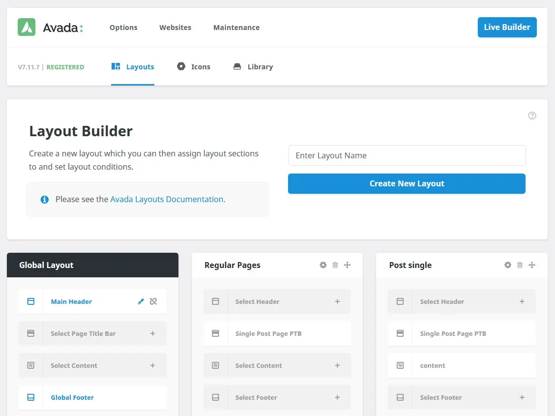
- Navigate to Avada Layouts: Once logged in, locate the Avada Layouts tab on the left-hand side menu. Click on it to expand the options.
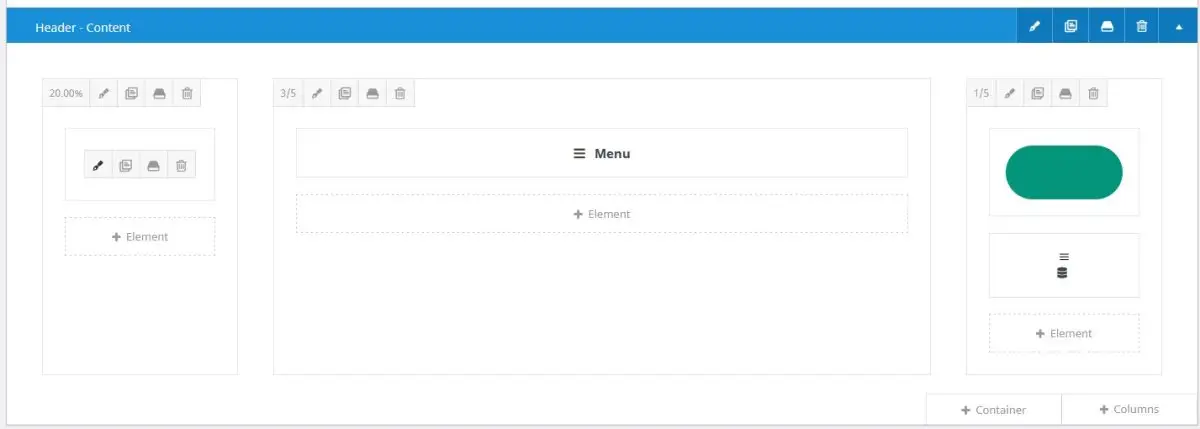
- Access the Header Builder: Within the Avada Layouts, you'll find on element called ‘Global Layout’. Look for the pen icon when hovering on the Header title and click on it. This will take you to the Header Builder interface.
- Explore the Header Builder Interface: You're now in the Header Builder, where you'll be able to construct and customize your website's header to your liking. Take some time to familiarize yourself with the various tools and options available.
Step 2: Choosing a Pre-built Header Layout:
Note: you’ll need to have “Avada Studio” switched on under the Avada theme Options > Features to have the option for importing pre-built layout.
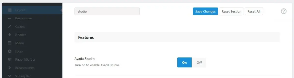
If you have followed the steps above, and you had to turn on Avada Studio then you can simply refresh the page of the “Main Header” Builder to see the enabled options.
Once you've accessed the Header Builder, selecting a pre-built header layout is a straightforward process.
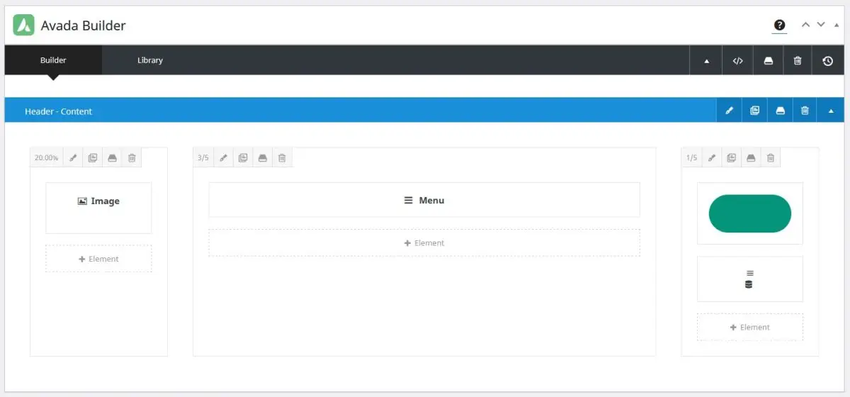
Click on the “Library” tab to the right of “Builder” (it’s the black bar in the Avada Builder), once the dialogue is open then switch to the “Studio” tab. Browse the available website header designs and click the plus icon to import the header. For this I have chosen “Overlay Header 3187”.
Step 3: Customizing the Header:
Now that you've chosen a pre-built header layout, it's time to customize it to align with your website's branding and functional requirements. Follow these steps to tailor your header design:
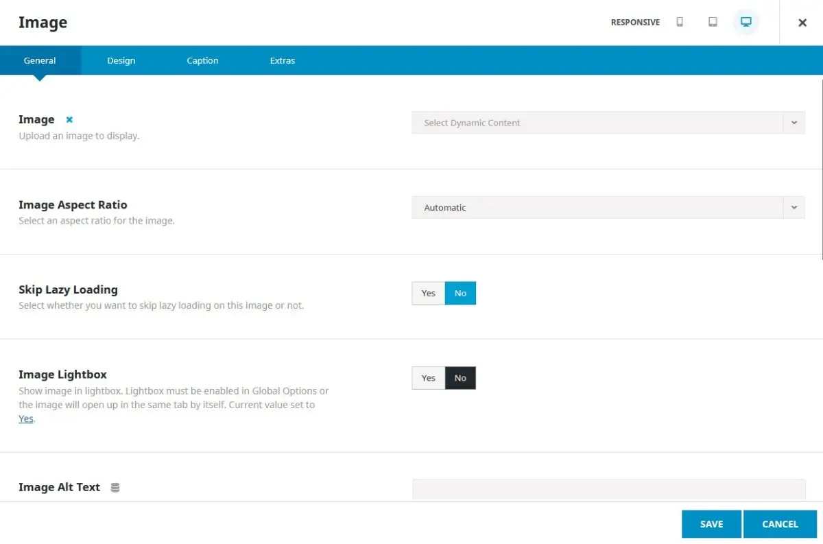
- Edit the image element. Click on the Pen icon to edit your image element.
Select the dynamic content icon to switch the field, use the dropdown to select Site > Logo, then for Logo Type, select “Default (Normal)” then add in the CSS Class “logo”. Click Save. To display the logo, we would now need to define the logo width. Switch to the Custom CSS tab, and insert the css .logo { width: 160px; } then Save Changes.
Additional (Optional) Step
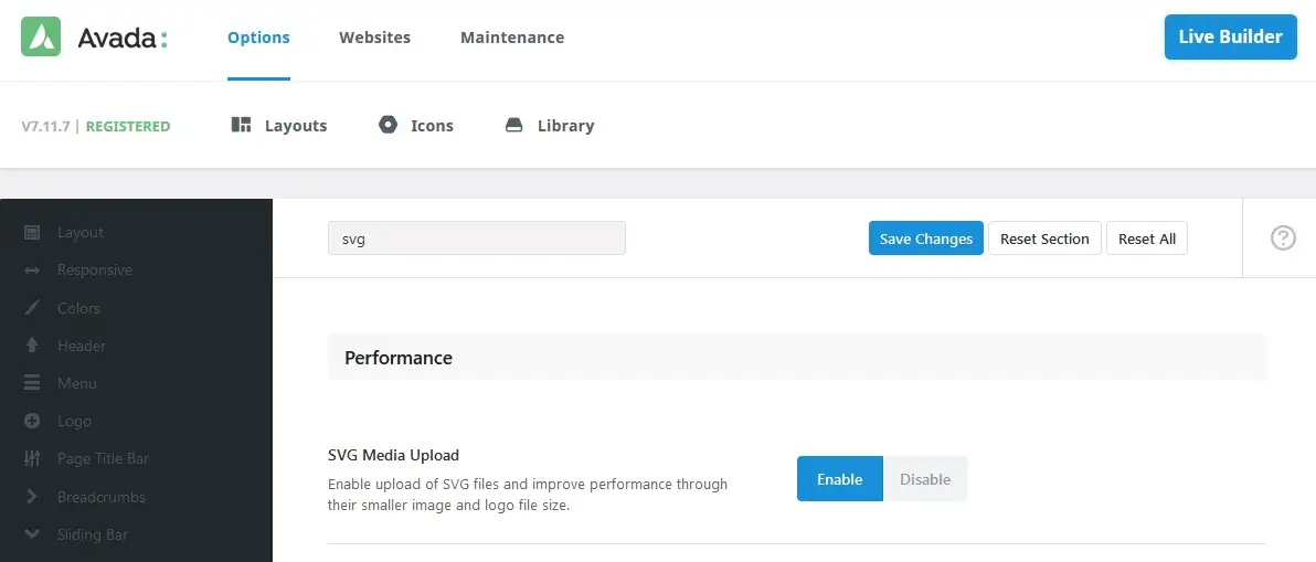
Turn on SVG image support
Duplicate your current Browser tab, then Go to Avada Global Options, search for svg, click Enable for SVG Media Upload.
- Still on the Avada Options, Switch to the “Logo” tab on the left, and Upload a default logo.
Note: because we are using an svg which is a vector file, we can scale the logo image to almost any size. So there’s no need for a retina and mobile image.
While you’re here, you can also switch to the “Favicon” sub tab and upload a favicon image. This time rather use a .png or .gif image file, as it’s more widely supported in the browser tabs. - Now back to the Header Builder. Click the Pen icon on the “menu” element to edit its settings.
From the Menu dropdown, select your Primary Menu. Continue by adding menu arrows and other general settings.
Switch to the “Main” tab, and Align Items to vertical center, with center Justification.
Scroll down and choose a font, or leave it empty to use your global styles. Add Main Menu Item Padding and Main Menu Item Spacing, in my case it’ll be 10px 0px 10px 0px, and 30px. Choose the text colour and hover text colour and Save. - Edit the Button element.
Choose the button URL and Insert Button Text, then Save. Feel free to customize the button Design, but for the purpose of this step, we’ll use the Avada Global defaults.
There is another icon element that we haven’t edited, which is the mobile menu for the imported Header, more of that in a second. - Edit the Parent Container and see the Minimum Height and Alignment settings below it, as well as the Design tab for more settings that control the Padding and Link Color.
It’s a good idea at this stage to Save and Update the section, then preview the site to see the header.
Note: When you import templates you often need to adjust the padding and margin, so be sure to override the default for the Home content layout to 120px. It’ll only be for the Homepage, otherwise we’d change it globally under the Avada Options.
Step 4: Utilizing Dynamic Values from Options Page with Advanced Views Shortcode
For this section of the article, we're going to use the following plugins:
Advanced Custom Fields (ACF) - One of the best custom field plugins.
Advanced Views Lite - Smart Templates to display Posts and ACF Fields.
To implement dynamic values from an options page, you can use the Advanced Custom Fields (ACF) plugin to create an options page. Alternatively, you may employ a PHP code snippet in your theme's functions.php file for similar functionality.
Here's how to do it:
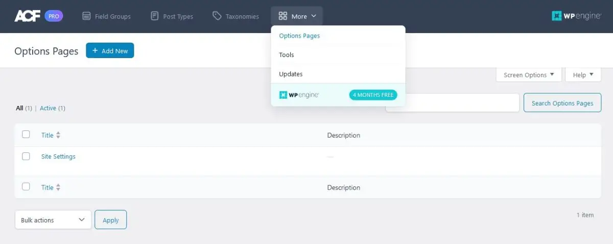
- Setup Options Page with ACF:
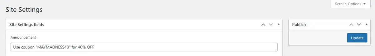
- Create an options page using ACF and then adding a Field Group. For example, you can include a "Announcement" plain text field within this Field Group.
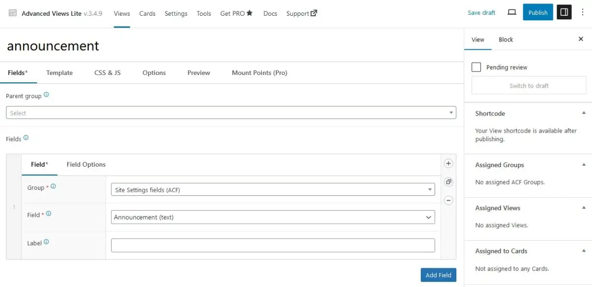
- Install Advanced Views:
- Install and activate the Advanced Views Lite plugin.
- Create a Layout:
- Within Advanced Views, create a Layout. Select the Field Group that contains your desired field and then choose the Field (in this case, the "Announcement" field).
- Configure and Publish the Layout:
- Customize the layout settings, template or styles as needed and publish the layout. Copy the generated shortcode.
- Integrate Shortcode into Header Section:
- Navigate to the header section within the layout settings.
- Add a container below the header content and drag it to the top. This container will hold the announcement text field.
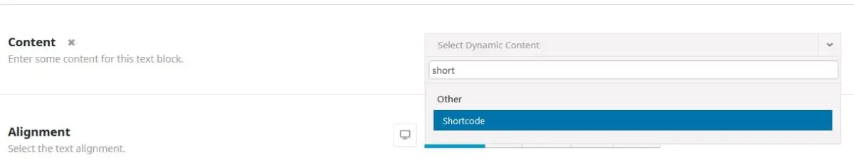
- Add a Text element within the column (I'm using the Avada Builder). Choose the "Dynamic" content option and search for/select the Shortcode element.
- Paste the copied shortcode into the Text element. Be sure to include the object-id="options" parameter within the shortcode to fetch the value from the options page.
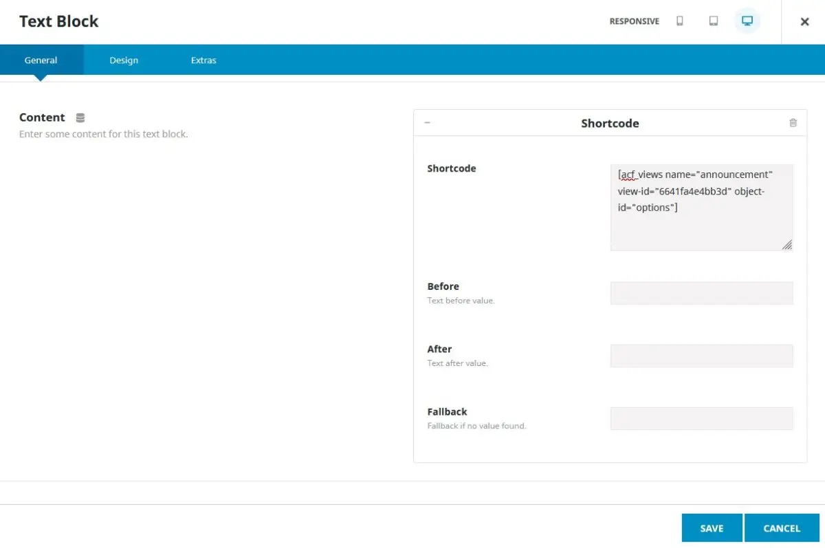
- Update or save your changes and preview the results. Remember to populate the "Announcement" field within your options page so there’s something to display.
By following these steps, you can seamlessly integrate dynamic values from your options page into your website's header section, providing a convenient method for site administrators to update essential information.
Step 5: Optimizing for Mobile Devices:
Now we know there’s this extra element, which in reality is an icon element that will trigger an off canvas action. We don’t want it in this case, and would prefer a simple menu that expands when tapping the mobile menu. Let’s delete the icon element and edit the Menu element.
On the General tab choose Element Visibility to include Small Screen and Medium Screen. Do the Same for the Column.
Switch to the Mobile tab, and choose Collapse to Mobile Breakpoint > Medium Screen. Now Save and Update the Section. Switch to the browser tab you’re using to preview, and refresh.
Step 6: Testing and Final Touches:
Testing is really a matter of previewing and adjusting the Alignment and padding until it’s perfect. Use the browser built in tools or an actual device, and try multiple devices to be sure it’ll look good, over time you’ll know what code and styles don’t work on which browsers.
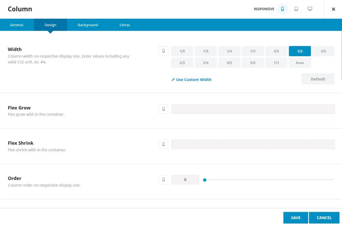
A Good tip to get the layout perfect is to use the Responsive tabs at the top of the Avada Container and Column’s edit dialogue. It’s quite easy, just switch to the device, and then choose a width, then Save, and do the same for the Column containing the Menu element.
That’s all there is to it.
Conclusion: Unlocking the Power of Avada Theme
In our journey from planning the header design to implementing dynamic values seamlessly, we've experienced the efficiency and convenience of using the Avada Builder. Without delving into code or theme template files, and we were still able to craft a visually appealing and functional header in just under an hour.
The Avada theme's robust foundation empowers users to explore a myriad of options for enhancing their website's design and functionality. With features like the Advanced Views framework, displaying custom fields and posts becomes a breeze. By experimenting in a development/staging environment and deploying changes to the live site with caution and regular backups, users can unlock the full potential of the Avada theme while maintaining the integrity and security of their website.
As a word of caution, it's imperative to avoid using nulled plugins, as they pose significant risks to website security and functionality. Always opt for legitimate and licensed plugins to ensure a smooth and secure website experience.
So, why not embark on your own exploration of the Avada theme's capabilities? With its user-friendly interface and powerful tools, you'll be amazed at how quickly you can transform your website into a masterpiece.
Happy exploring!
Thank you for reading! to our monthly newsletter to stay updated on the latest WordPress news and useful tips.

Stuck with development or facing an issue?
WPLake offers affordable on-demand website development and design.
No matter the size of your project - contact us now, and we'll get it done for you!
Frequently Asked Questions Test Your Knowledge
FAQ mode
/
Learning mode
- Where do I find the Avada Global Options?
In the Avada Menu, select "Options," then use the submenu to navigate to each option. Set the body font, color palette, or other preferences. If not overridden on individual pages, these settings will serve as the defaults.
- Can I have a different header for my homepage?
Yes, you could have a special header design for your homepage only. To do this, visit Avada > Layouts, choose a New section in the Home layout and create your header.
- Responsive view only element possible?
To show an element only for a mobile device, use the "Column Visibility" or "Container Visibility" options.
- Can I add a transition or animation to my header?
Yes, of course. Avada offers these settings under the "Extras" tab in your Column or Container Dialogue, see all the way at the bottom and choose "Animation Type", then Save or configure the options.
Course navigation: Avada Theme
Lesson #2
Time to read: 12 mins
Updated 16 May, 2024
Lesson #3
Time to read: 10 mins
Updated 23 May, 2024
Content links (10)
1.
avada.comAbout the Author